Asynchronous and Cost Effective Data Science Workflows for High Performance Sport
Author
David Awosoga Performance Data Scientist Canadian Sport Institute Ontario
Introduction
In this article, a reproducible workflow for implementing an end-to-end data science pipeline in an asynchronous and cost effective manner is presented. Inspiration was provided by Project Immortality, a presentation by Tan Ho at the 2022 RStudio Conference, hours of reading package documentation, long conversations with LLM’s, and hard (but helpful) lessons learned along the way. The case study provided in this article is intended to reflect the needs of practitioners and researchers working with high performance sports data, but the pipeline is designed to be flexible for a wide variety of data science initiatives.
Preliminaries
Data Representation
Before performing any data science, we must first ask ourselves how to format and store data to make it amenable for data analysis. Adapted from the Tidy Data seminal paper by Hadley Wickham, the following tabular format representation is encouraged wherever possible, such that:
Each row represents an observation
Each column represents a variable
Each observational unit is a table
Each observation should have a unique identifier where appropriate, and use snake_case (all lowercase letters with underscores between words) for column names. The ISO 8601 format (YYYY-MM-DD) should be used for dates and conditional formatting should be removed from source data and represented instead in a separate data dictionary/legend. Missing values should be clearly labelled as NA or appropriately described in metadata (eg -1 or 999). Finally, fields should be either numeric or character for maximum cross-platform and programming language compatibility, and special data types should be avoided where possible.
Data Science Workflow
The data science workflow, as described in R for Data Science (2e) by the aforementioned Hadley Wickham, consists of how information is transformed from raw data into actionable insights. A complete workflow consists of the following steps:
Import: Identify sources of and methods to acquire data, utilizing automation wherever possible.
Tidy: Wrangle data into a tidy format conducive for understanding its properties and store it in an accessible and secure location. This should be performed autonomously where possible.
Transform: Extract features of interest from data and perform additional computations to augment the dataset.
Visualize: Generate informative illustrations of the transformed data in order to provide additional context to insights.
Model: Apply statistical methods, machine learning, and artificial intelligence to understand data via prediction, identifying trends, and detecting anomalies.
Communicate: Interpret results and produce reports, web applications, and other compelling summaries of finds in a way that is digestible and actionable for your stakeholders.
Guiding Questions
For each stepe in the data science workflow the following guiding questions can be used to influence practical implementation choices and ensure that appropriate applications to an intended use case are fulfilled.
Import
What information is necessary to address my questions?
Where can I acquire this information from?
How can this information be collected?
Can this be performed programmatically via web scraping, an application programming interface (API), or an existing package/library?
Must this be performed manually, such as live data collection or a bulk download/export?
How frequently does this information need to be collected?
Tidy
How is the information that I am looking to acquire currently formatted?
What pieces of information do I want to retain to convert into a tidy format?
Transform
What metrics would I like to derive form the collected information?
What subject matter (domain) knowledge is necessary to calculate auxiliary values?
Visualize
How should the information be presented visually?
How has the information been visualized in analogous or adjacent use cases?
Model
Will this information be used to predict future outcomes, make inferences on past events, or describe the phenomena taking place?
Communicate
Who are my stakeholders receiving the insights generated from this analysis?
What is the most sustainable medium for these insights to be shared?
How often will these insights be shared?
Prerequisites
To reproduce the analysis performed in the subsequent case study, perform the following tasks:
GitHub is a cloud hosting service for Git-based projects.
A GitHub Free account provides users with features such as unlimited collaborators on unlimited public repositories, GitHub Pages in public repositories, and 2,000 GitHub Actions minutes per month.
Educators, students, and several other parties are eligible for GitHub Education accounts, which include a free GitHub Pro subscription and numerous other benefits, including an extra 1,000 GitHub Actions minutes per month, Wikis, and the ability to host GitHub Pages from private repositories.
Install a programming language.
R, Python, and Julia are the primary programming languages used for data science
Install an integrated development environment (IDE).
In this case study, we find ourselves interested in how Canadian athletes are performing in the World Athletics (track and field) rankings, perhaps so that we can determine which athletes to provide funding to in the upcoming season. We use the guiding questions from Section 2 to ensure that we tackle this question in a systematic manner, which will culminate in developing an asynchronous and cost effective workflow to sustainably turn information into insights.
Import
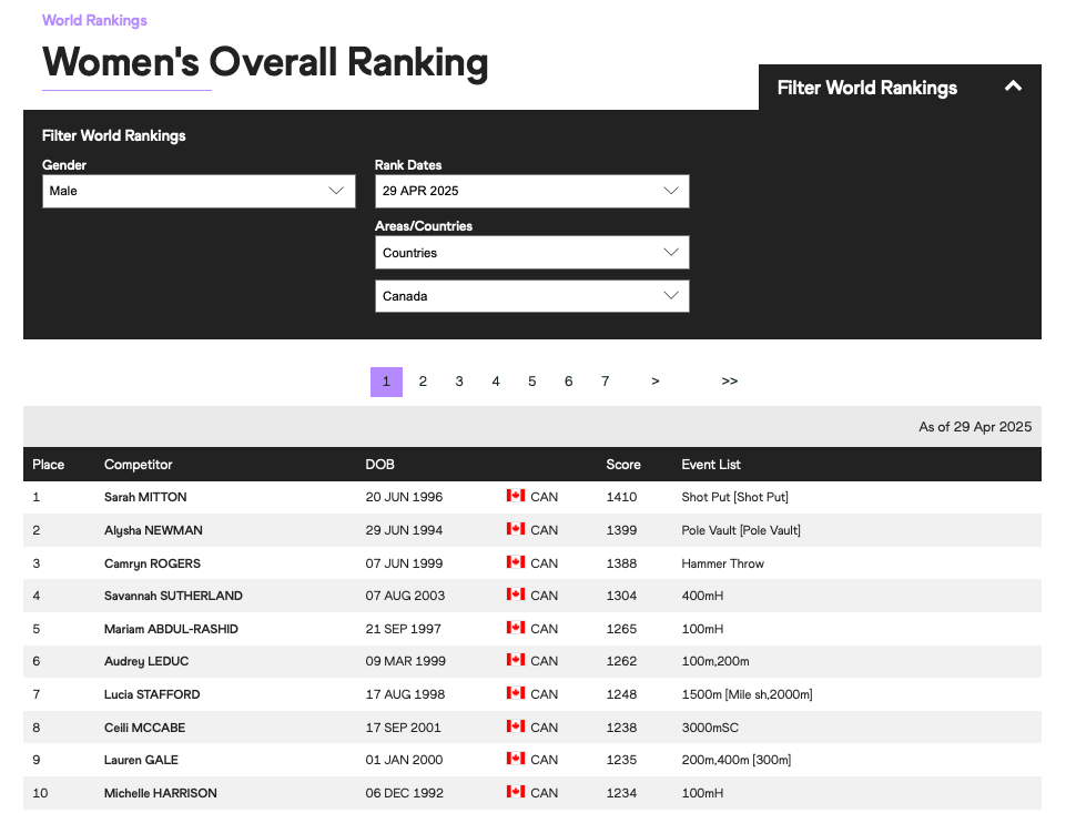
After loading the necessary packages, we find a webpage with the desired information from the World Athletics website and decide to directly web scrape the page since it is written in static HTML.
World Athletics Women’s Overall Ranking as of April 29, 2025
We see that there are three sections of the query string: regionType, region, and page, alongside a url endpoint of women, which after some perusing we find can also be set to men. Therefore to make our web scraping protocol as flexible as possible we initialize and set those variables dynamically instead of hardcoding them in the read_html call.
Note that this webpage is paginated, meaning that only a subset of the entire table is rendered on each page. Therefore, we run the web scraper in a while loop and request new pages by incrementing the page number at the end of each iteration until an empty page is observed, after which the loop is terminated. We run this for both men and women.
Web Scraping
# Load packageslibrary(tidyverse) # for data cleaning and tidyinglibrary(rvest) # for web scraping HTML tables# initialize variablesregion_type ="countries"sexes =c("men", "women")region ="can"all_rankings =list()for (sex in sexes) {# initialize athlete_rankings and page number athlete_rankings = tibble::tibble() page =1# the website is paginated, so we need to loop through each pagewhile(TRUE) { website_url <-paste0("https://worldathletics.org/world-rankings/overall-ranking/", sex, "?regionType=", region_type, "®ion=", region, "&page=", page) webpage <- rvest::read_html(website_url) new_table <- webpage |> rvest::html_table() |># extract the table of rankings from the webpage html dplyr::bind_rows() # convert the list of dataframes into one dataframeif(nrow(new_table) ==0) break# we have reached the end of the table page <- page +1 athlete_rankings <- dplyr::bind_rows(athlete_rankings, new_table) # add new rows to existing rowsSys.sleep(2.5) # Insert pauses so as to not overwhelm a webpage } all_rankings <-append(all_rankings, list(athlete_rankings)) # combine mens and women's results into list}
Now that we have acquired the data, we can use dplyr::glimpse to help identify which column names and values require remediation. We use this information to perform several cleaning steps:
Use janitor::clean_names to format the column names in snake_case
Combine both men’s and women’s tables by adding a column to differentiate between them using the id argument in dplyr::bind_rows
Give the unnamed x4 column a more informative name
Additional subject matter knowledge is necessary to understand why multiple events appear in events_list. After further examination, we find that the score is calculated as the average performance score of the athlete across the events that they compete in. Athletes are assigned “main events”, which are the first elements in the events_list, and “similar events”, which are the elements in the [].
Different practitioners will have different uses for this information. For this case study, we will only consider an athlete’s “main event” when performing event grouping, and as such use some string manipulation using regular expressions to remove the “similar events”.
Finally, we notice that in the date of birth (dob) column only the year element is included for some athletes, while the entire date is retained for others. For consistency, we retain only the year for all athletes using string manipulation and several functions from the lubridate package.
Data Tidying
combined_table <- dplyr::bind_rows(all_rankings, .id ="sex")dplyr::glimpse(combined_table) # cursory look at the tablecombined_table <- combined_table |> janitor::clean_names() |># format the column names in "snake_case" dplyr::mutate(dob =case_when( stringr::str_detect(dob, "^\\d{4}$") ~as.integer(dob), # if only the year is displayed, preserve it!is.na(lubridate::dmy(dob, quiet = T)) ~ lubridate::year(lubridate::dmy(dob, quiet = T)),# if the entire birthdate is diplayed, extract the year.default =NA_integer_# if date is missing, use NA ),sex =if_else(sex =="1", "Men", "Women"), # since the men's table was scraped firstevent_list =str_remove(event_list, "\\s\\[.+\\]") # remove "similar events" ) |> dplyr::rename(country = x4, yob = dob) # convert an unnamed column to 'country' and date of birth to year of birth
Transform
In this step, we aggregate the main events of each athlete into the following (unofficial) event groups.
Before we aggregate the data, we perform some remedial measures to make sure that athletes appear in exactly one event group. For this case study, we simply count the number of “main events” that an athlete has from each event group, and then select the group that has the most main events participated in by that athlete. Ties are separated arbitrarily, which in a more rigorous analysis can be further specified.
Data Transformation
combined_table <- combined_table |> dplyr::mutate(event_list = stringr::str_replace(event_list, "10,000", "10000")) |># so that the comma isn't caught by the delimeter tidyr::separate_longer_delim(cols = event_list, delim =",") |> dplyr::mutate(event_group =case_match( event_list,c("100m", "200m", "400m", "400mH", "100mH", "110mH") ~"Sprints",c("800m", "1500m", "3000mSC") ~"Middle Distance",c("5000m", "10000m") ~"Long Distance",c("Heptathlon", "Decathlon") ~"Combined Events",c("High Jump", "Long Jump", "Triple Jump", "Pole Vault") ~"Jumps",c("Shot Put", "Discus Throw", "Hammer Throw", "Javelin Throw", "Javelin Throw (old)") ~"Throws",c("10km Walk", "10km Road", "20km Walk", "35km Walk", "50km Walk", "Half Marathon", "Marathon") ~"Road Races",c("Cross Country", "XC Senior Race") ~"Cross Country",.default =NA )) |> dplyr::add_count(competitor, event_group, name ="n_events") |> dplyr::slice_max(order_by = n_events, by = competitor, with_ties = F) # takes the first event t in case of ties
From there we can take various summaries to answer supplementary questions about Canada’s performance across event categories, such as what Canada’s best event groups are.
Canada’s best event groups
# What are Canda's best event groups?combined_table |> dplyr::group_by(event_group, sex) |> dplyr::summarise(average_performance =mean(score, na.rm = T), athletes = dplyr::n(), .groups ="drop") |> dplyr::mutate(rank = dplyr::min_rank(dplyr::desc(average_performance)), .before =1) |> dplyr::arrange(rank) |># additional code to make the table format nicely gt::gt() |> gtExtras::gt_theme_538() |> gt::fmt_number(decimals =0) |> gt::cols_label_with(fn = \(x) gt::md(stringr::str_replace_all(x, "_", "<br>")) ) |> gt::cols_align(align ="center") |> gt::tab_header(title ="Canada's Best Event Groups",subtitle =paste("As of", format(Sys.Date(), "%B %d, %Y")) ) |> gt::tab_caption(caption = gt::md("Data taken from [https://worldathletics.org](https://worldathletics.org)" ))
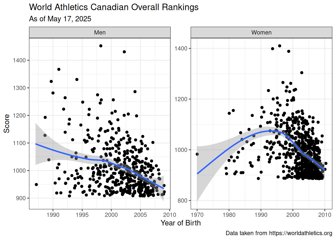
Before we model our data, we first visualize the relationship between the performance score of athletes and their year of birth. We can use scatterplots to do so with a smoothed line to identify the trend. This can be thought of as an aging curve, which is a very popular field of study in sports literature.
Visualization of Rankings Data
ggplot2::ggplot(data = combined_table, mapping = ggplot2::aes(x = yob, y = score)) + ggplot2::geom_jitter() + ggplot2::geom_smooth() + ggplot2::labs(title ="World Athletics Canadian Overall Rankings", subtitle =paste("As of", format(Sys.Date(), "%B %d, %Y")),caption ="Data taken from https://worldathletics.org",x ="Year of Birth",y ="Score") + ggplot2::facet_wrap(~sex, scales ="free") + ggplot2::theme_bw()
Figure 1
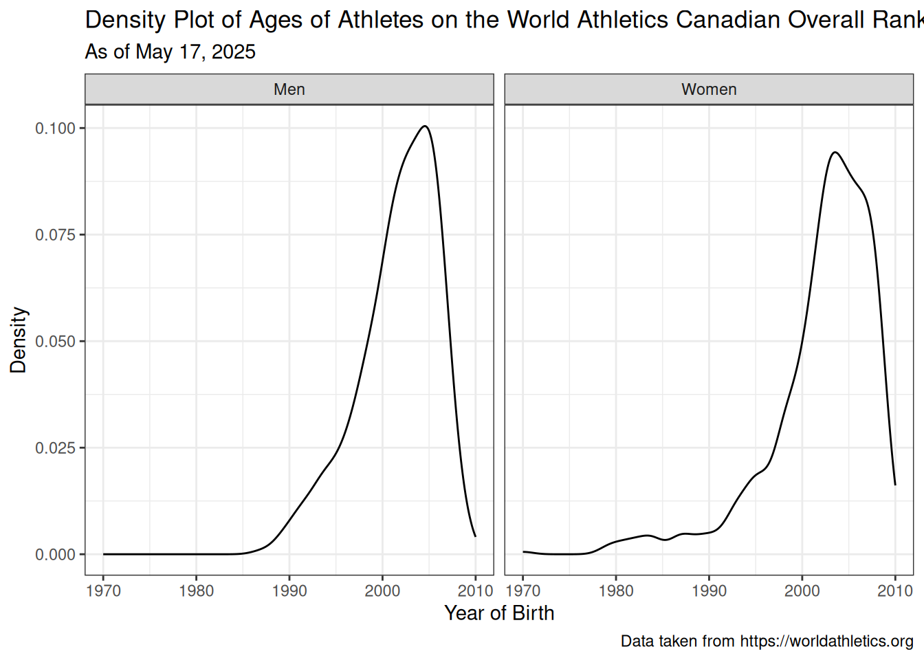
From these aging curves we notice that there is unsurprisingly a large proportion of athletes born after 2000. We can investigate this phenomena by looking at the distribution of years of birth among athletes, again separated by sex.
Distribution of Ages of Athletes
ggplot2::ggplot(data = combined_table, mapping = ggplot2::aes(x = yob)) + ggplot2::geom_density() + ggplot2::labs(title ="Density Plot of Ages of Athletes on the World Athletics Canadian Overall Rankings", subtitle =paste("As of", format(Sys.Date(), "%B %d, %Y")),caption ="Data taken from https://worldathletics.org",x ="Year of Birth",y ="Density") + ggplot2::facet_wrap(~sex) + ggplot2::theme_bw()
Figure 2
We see that the most prominent year of birth for Canada’s ranked male athletes is 2005, while for women it is 2003. This could lead to further exploratory questions that are out of scope for this case study.
Model
We can use the lm function to build a linear regression model to predict the performance score of an athlete as a function of their year of birth and sex. We add a quardratic term \(yob^2\) to the model to account for the non-linear relationship observed between year of birth and performance from Figure 1.
Linear Regression Model
# Fit a linear regression modelmodel <-lm(score ~ yob +I(yob^2) + sex, data = combined_table)# Print the summary of the modelsummary(model)
Call:
lm(formula = score ~ yob + I(yob^2) + sex, data = combined_table)

Residuals:
    Min      1Q  Median      3Q     Max
-164.43  -53.25  -11.82   44.30  419.97

Coefficients:
              Estimate Std. Error t value Pr(>|t|)
(Intercept) -1.787e+06  1.999e+05  -8.940   <2e-16 ***
yob          1.796e+03  2.001e+02   8.973   <2e-16 ***
I(yob^2)    -4.508e-01  5.008e-02  -9.001   <2e-16 ***
sexWomen    -3.544e+00  4.890e+00  -0.725    0.469
---
Signif. codes:  0 '***' 0.001 '**' 0.01 '*' 0.05 '.' 0.1 ' ' 1

Residual standard error: 79.3 on 1117 degrees of freedom
  (32 observations deleted due to missingness)
Multiple R-squared:  0.1746,    Adjusted R-squared:  0.1724
F-statistic: 78.75 on 3 and 1117 DF,  p-value: < 2.2e-16
The model summary shows that the model is statistically significant, with an adjusted R-squared value of 0.172. The coefficients for the year of birth and its square term are both statistically significant, which is exactly what we observed visually in the Section 3.4. Interestingly enough, we see that sex, which is encoded as a dummy variable, is not a statistically significant predictor of performance score.
Communicate
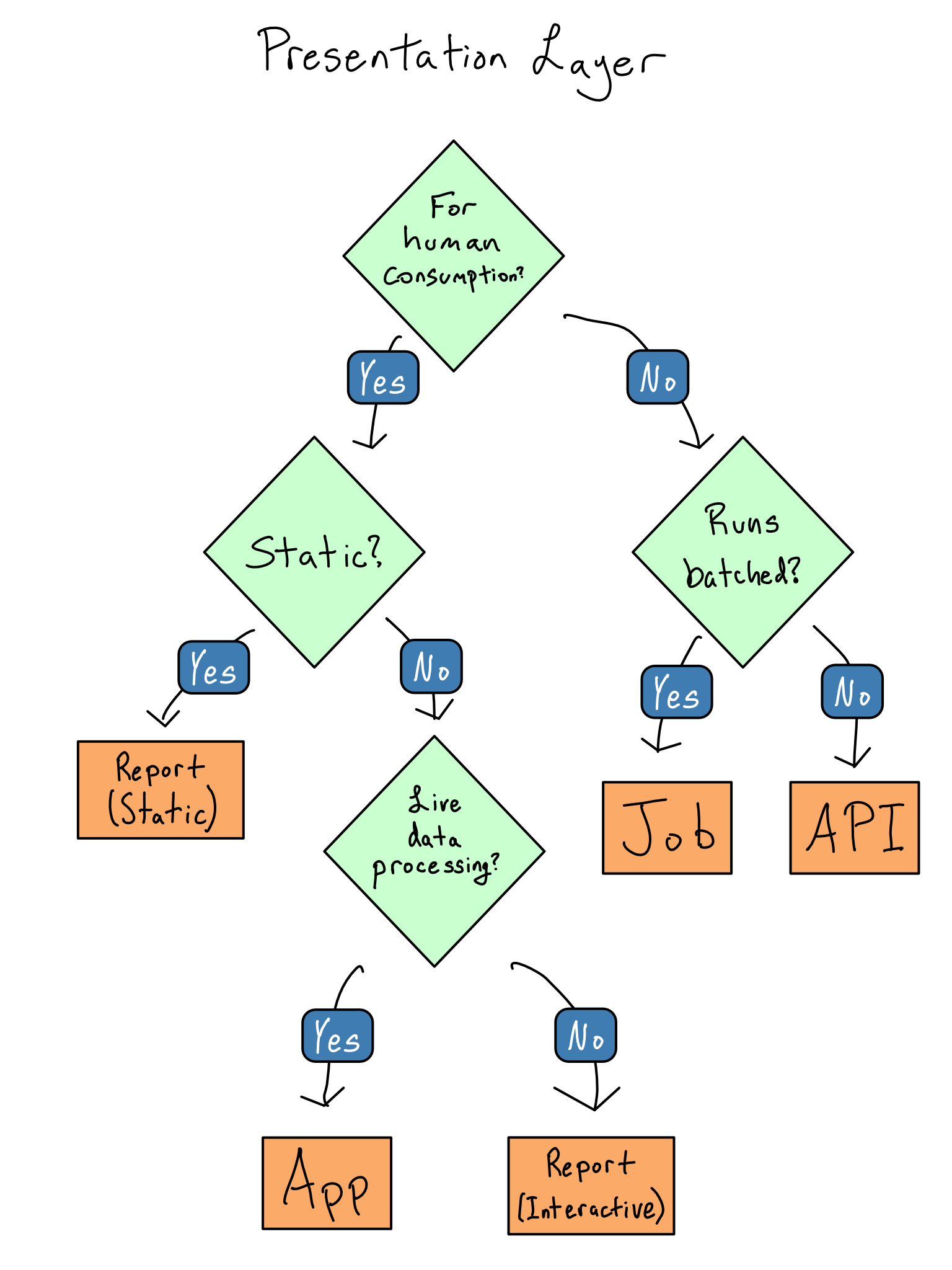
There are numerous avenues by which the insights gleaned from the data science workflow can be disseminated. In term of deciding which medium to choose, consider the following flow chart:
Flow Chart to decide which presentation layer (medium) to utilize - DevOps for Data Science by Alex K Gold
Since this analysis is for humans and is a static document, we go with a static report, and use Quarto. Quarto is particularly flexible when it comes to publishing options, and a full list of available publishing services and their corresponding use cases can be found HERE. This article in particular is published using GitHub Pages, which are static websites that are hosted directly from a GitHub repository for free.
Extensions
With the data science pipeline complete, there are several important extensions possible for this workflow.
Task Automation
We first note that World Athletics site rankings are updated on a weekly basis, and since this report is generated statically, the document will only contain results from the last time that it was rendered. Since this rendering task is something that we would like to do regularly, we want to leverage some sort of scheduler to automate this process. This is where GitHub Actions comes into play.
GitHub Actions is a platform that allows users to automate tasks within a GitHub repository without needing to set up any external services or servers. These workflows can be triggered by various events, such as pushing code to a repository, on a schedule, or even via a different action. This makes Actions an excellent tool for automating tasks like data acquisition, testing, and deployment.
Here, we can set up a GitHub Actions workflow to automate the web scraping, data tidying, and transformation steps performed in Section 3.1, Section 3.2, and Section 3.3. We consolidate the code snippets into a new R script called get_data.R, adding a line at the end to save the resulting dataframe as a .csv.
Next, we create a new file in the .github/workflows directory of our repository and call it something like get_data.yml. In it we write the following:
on:workflow_dispatch:schedule:-cron:'0 0 * * 0' # This will run the workflow every Sunday at midnight UTCname: Scrape World Rankings Datajobs:build:runs-on: ubuntu-lateststeps:-name: Checkout codeuses: actions/checkout@v4-name: setup Ruses: r-lib/actions/setup-r@v2with:use-public-rspm:true-name: Install Packagesuses: r-lib/actions/setup-r-dependencies@v2with: packages: | any::pacman-name: execute r scriptenv:GITHUB_PAT: ${{ secrets.GITHUB_TOKEN }}run: Rscript -e 'source("get_data.R")'
From there, we can leverage the publish.yml script provided by Quarto to render the report and publish it to GitHub Pages after the data is pushed to the repository (which can also be done using Actions). This way, we can ensure that our data is always up-to-date without having to manually run the script each time.
At this point you may be wondering - this is great, but how much will this cost? And the answer, more often than not, is - almost nothing. GitHub Actions is free for public repositories, and for private repositories, you get 2,000 minutes of free usage per month (3,000 for GitHub Pro accounts). This particular pipeline takes less than 5 minutes to run, meaning that you could run hundreds of such jobs per month without ever having to pay a cent. This makes GitHub Actions an incredibly attractive option for asynchronous data acquisition and information-to-insight workflows.
Data Storage
Suppose that we have multiple sets of data that we want to draw information from that are updated at different time intervals. Or consider a situation where we want to save rankings from previous weeks so that we can perform some sort of longitudinal analysis to see how they change over time. In these examples, and generally as a good practice such that commits to a repository are not too large, we want to store the data in a separate location. While a database solution from cloud providers such as AWS, Google Cloud Storage, or Azure are great options, they can be expensive and require a lot of setup to integrate into an existing workflow. Therefore, an incredibly effective solution for remote yet easily accessible data storage is GitHub Releases.
GitHub Releases allows users to create and manage iterations of software projects. This typically involves compiled binaries, source code, and other files related to your project, but can also be used to store data files. Although individual files in a release must be under 2GiB, there is currently no limit to the total size of an entire release, nor a limit to bandwidth usage. This means that one can store massive amounts of data within a GitHub repository with seamless integration to an existing data science pipeline. In R, the piggyback package is an excellent tool for managing files in GitHub Releases. Here is an example of how it can be used in this project to transfer the scraped World Athletics rankings to and from a GitHub Release.
library(piggyback) # for uploading and downloading files from GitHubrepository ="CSIOntario/makerspace"repository_tag ="data"local_data ="data/athlete_rankings.csv"readr::write_csv(combined_table, local_data)# if a release doesn't exist, make oneif(length(piggyback::pb_releases(repo = repository)) <1) piggyback::pb_new_release(repo = repository, tag = repository_tag)# Upload Datapiggyback::pb_upload(repo = repository,tag = repository_tag,file = local_data, overwrite = T)# for private repos you'll have to supply a token in the `.token` argument to # download data from a release, but anyone can download data from a public release# Download Datapiggyback::pb_download(file ="athlete_rankings.csv",repo = repository,tag = repository_tag,dest ="data", overwrite = T)readr::read_csv(local_data) # load it into R
Conclusion
This concludes this article, where we have implemented an end-to-end data science pipeline that is maintained completely asynchronously and in the overwhelming majority of use cases, is completely free. The integration of GitHub Actions and GitHub Releases into the data science workflow allows for scalable and sustainable data acquisition and storage, which allows such projects to “live forever”.